Loading... ##### 一、配置app.json ```json "tabBar": { "custom": true, "list": [ { "pagePath": "pages/index/index", "text": "首页" }, { "pagePath": "pages/gridPage/index", "text": "grid" } ] }, ``` ##### 二、在项目根目录下新建custom-tab-bar文件夹并自定义Tabbar ###### 1、wxml代码 ```html <!--custom-tab-bar/index.wxml--> <view class="tab_bar"> <view class="tab_br_item" wx:for="{{list}}" wx:key="*this" bind:tap="onChange" data-index="{{index}}" data-path="{{item.pagePath}}"> <view class="{{tabIndex === index ? 'active' : ''}}">{{item.text}}</view> </view> </view> <view class="indicator {{rotated ? 'select' : ''}}"> <view class="indicator_item_left"></view> <view class="indicator_item_right"></view> <view class="indicator_item" bind:tap="clickFun"> <view class="indicator_item_btn" style="{{childStyle}}">主</view> </view> <view class="indicator_icon indicator_icon{{index + 1}}" wx:for="{{childList}}" wx:key="*this">{{item.text}}</view> </view> ``` ###### 2、wxss代码 ```css /* custom-tab-bar/index.wxss */ .tab_bar { position: relative; display: flex; width: 100%; height: 160rpx; background: #ffffff; justify-content: space-around; align-items: center; text-align: center; } .active { font-weight: 800; } .indicator_item { position: absolute; top: 0; left: 50%; transform: translate(-50%, -50%); background: #FF9F7F; width: 160rpx; height: 160rpx; border-radius: 50%; display: flex; align-items: center; justify-content: center; box-sizing: border-box; border: 16rpx solid #000; z-index: 2; } .indicator_item_btn { width: 100%; height: 100%; background: transparent !important; border-radius: 50%; display: flex; align-items: center; justify-content: center; } .indicator_item_left { position: absolute; top: 0; left: calc(50% - 93rpx); transform: translateX(-50%); background: transparent; width: 40rpx; height: 40rpx; border-top-right-radius: 40rpx; box-shadow: 0 -20rpx 0 0 #000; } .indicator_item_right { position: absolute; top: 0; right: calc(50% - 93rpx); transform: translateX(50%); background: transparent; width: 40rpx; height: 40rpx; border-top-left-radius: 40rpx; box-shadow: 0 -20rpx 0 0 #000; } .indicator_icon { position: absolute; top: 0; left: 50%; transform: translate(-50%, -50%); width: 100rpx; height: 100rpx; border-radius: 50%; background: red; display: flex; align-items: center; justify-content: center; transition: all 0.5s; z-index: 1; opacity: 0; pointer-events: none; } .select .indicator_icon { opacity: 1; pointer-events: auto; } .select .indicator_icon1 { top: -55px; left: 25%; } .select .indicator_icon2 { top: -110px; left: 40%; } .select .indicator_icon3 { top: -110px; left: 60%; } .select .indicator_icon4 { top: -55px; left: 75%; } ``` ###### 3、json代码 ```json { "component": true, "usingComponents": {} } ``` ###### 4、js代码 ```js // custom-tab-bar/index.js Component({ /** * 组件的属性列表 */ properties: { }, /** * 组件的初始数据 */ data: { // Tabbar 列表 list: [{ "pagePath": "/pages/index/index", "text": "首页" }, { "pagePath": "/pages/gridPage/index", "text": "grid" } ], // 当前选中项 tabIndex: 0, // 子级列表 childList: [{ "text": "次1" }, { "text": "次2" }, { "text": "次3" }, { "text": "次4" }, ], // 旋转 rotated: false, // 子按钮样式 childStyle: '', }, /** * 组件的方法列表 */ methods: { // 页面跳转 onChange(e) { let path = e.currentTarget.dataset.path; let index = e.currentTarget.dataset.index; this.setData({ tabIndex: index, rotated: false, childStyle: 'transform: rotate(0deg); transition: transform 0.3s', }) wx.switchTab({ url: path }) }, // 主按钮点击 clickFun() { let rotated = this.data.rotated; let rotate = rotated ? 'rotate(0deg)' : 'rotate(220deg)'; this.setData({ rotated: !rotated, childStyle: `transform: ${rotate}; transition: transform 0.3s`, }) }, } }) ``` > 注:因为组件更新问题,以上方式自定义的Tabbar需要在每个Tabbar页面添加如下代码 ```js onShow() { if (typeof this.getTabBar === 'function' && this.getTabBar()) { this.getTabBar().setData({ tabIndex: 1 // 此值为custom-tab-bar/index.js文件data中的tabIndex值(根据当前页面自行确定) }) } }, ``` ##### 三、效果图 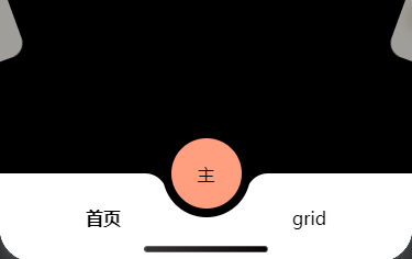 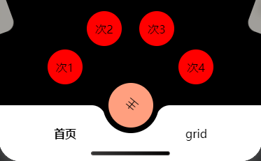 > 注:需全局设置页面禁止滑动,并且在app.wxss中设置全局高度已经`overflow: hidden;`属性(最好将页面的高度减去自定义组件高度160rpx+20rpx) 最后修改:2026 年 03 月 26 日 © 允许规范转载 打赏 赞赏作者 支付宝微信 赞 如果觉得我的文章对你有用,请随意赞赏
